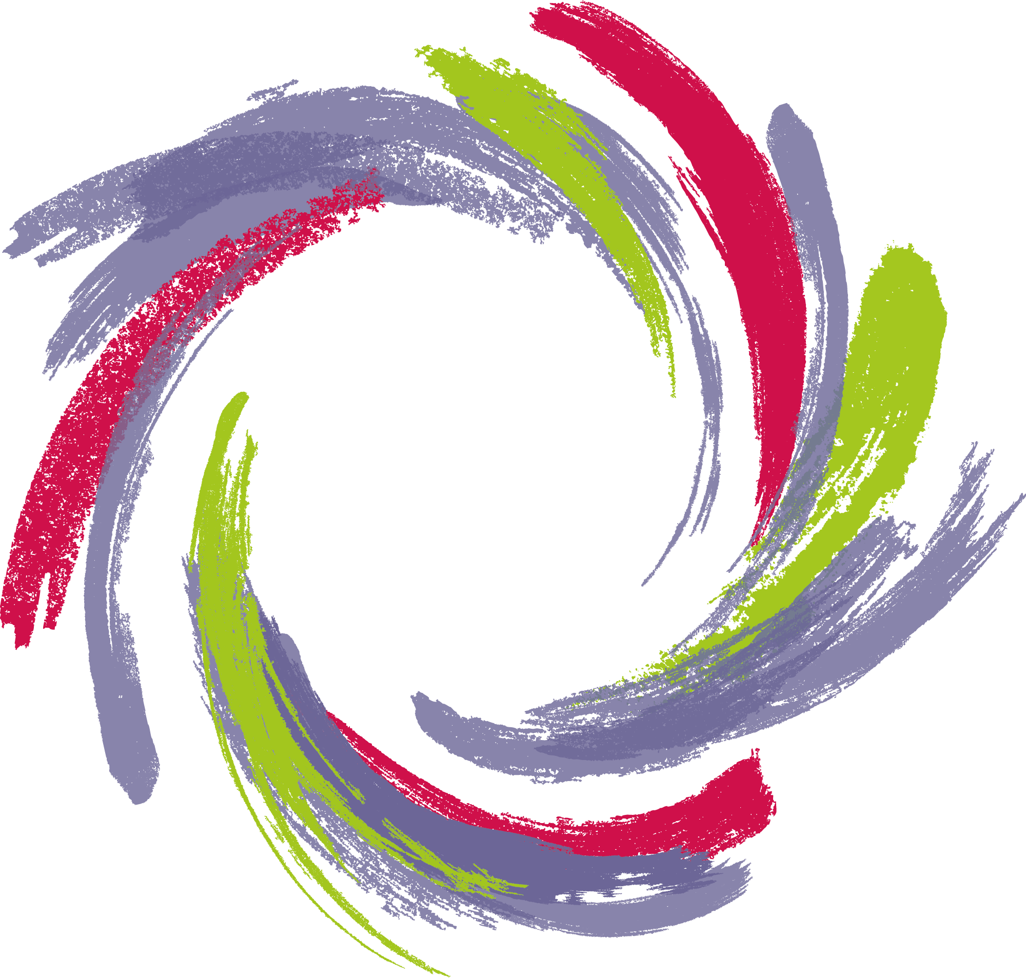
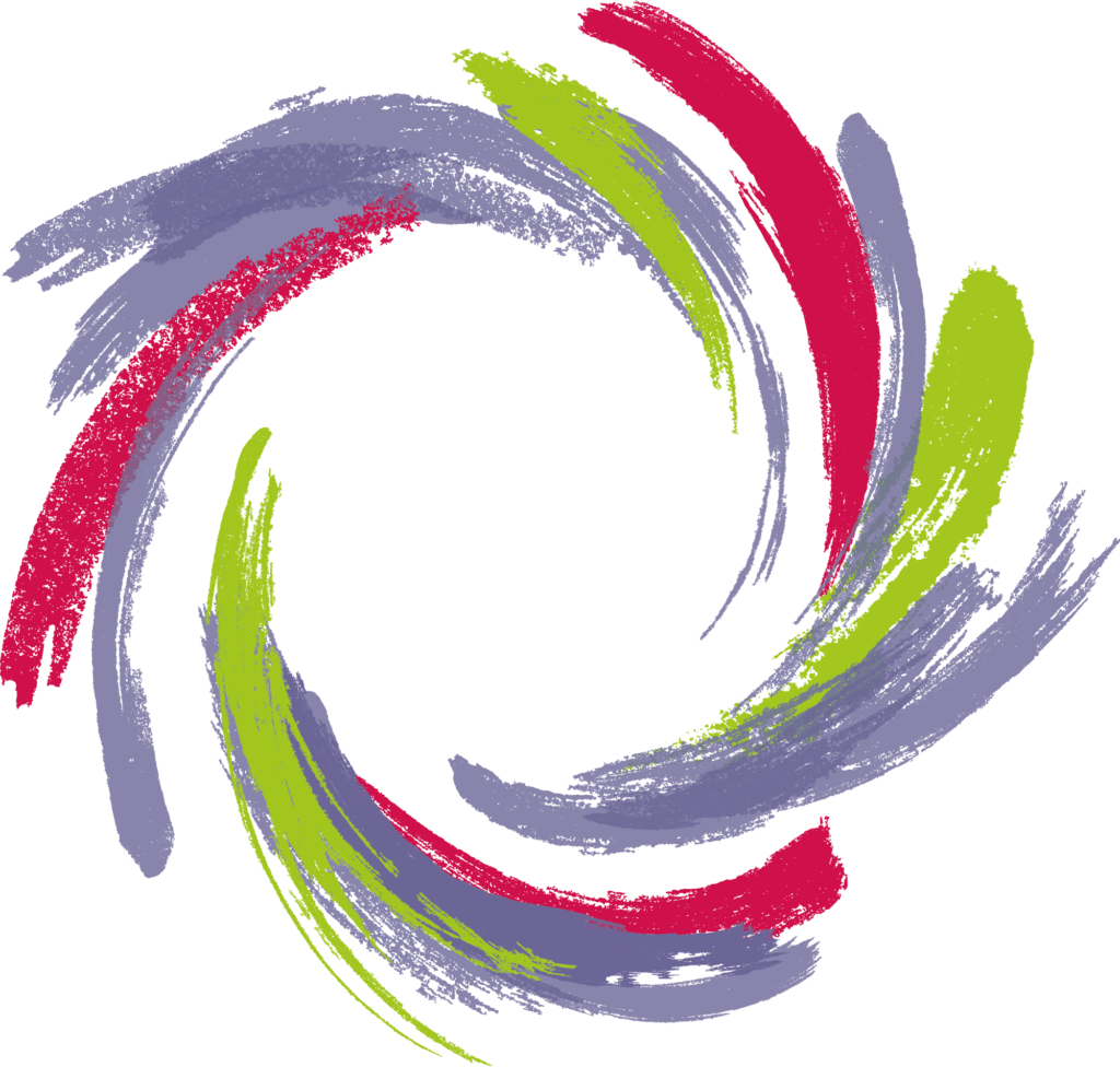
Based on ideas approved at the EGM of 4 September, we have designed a new logo to symbolically highlight the new dynamic which has been sparked within the Network. More dynamic and modern than the previous design, it includes a baseline that reflects developments in the Network and its mission.
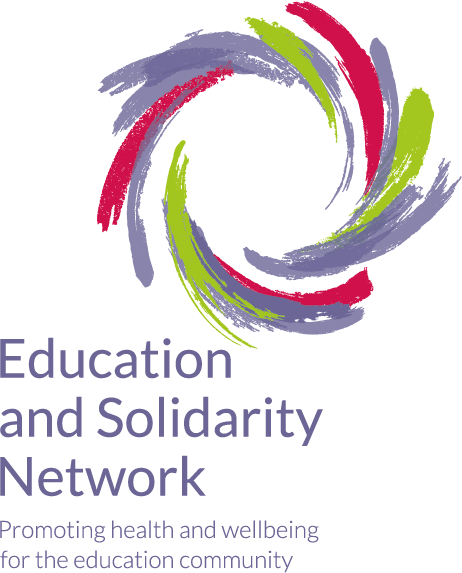
This logo, which retains some aspects of the previous design such as the purple colour and text, visually translates our desire to galvanise Network member and partner involvement by creating synergies between different cultures and different groups (education professionals, social protection professionals, community activists, mutual society members etc.). All this is aimed at creating a spiral of success based on concrete projects.
- A circular design, representing the virtuous circle of solidarity and the mutually beneficial impact of improving education and health
- A handmade look, reflecting the exploratory, experimental and innovative nature of our projects and ideas
- Brush strokes, as symbols of creativity and originality but also as a reference to the world of education and childhood
- A blank centre, reflecting the mechanics of a network which is intended as a decentralised organisation whose energy and substance come from its members
- Motion, symbolising the collective dynamic which has taken hold and the energy which will enable us to get more and more people involved in our priorities and projects!
This new logo, which was adopted by the EGM, will soon be used in all our communication tools.